This is a big week in the United States. As you might know, this week we’ll elect our next president. While there is no doubt this has been an unusual political season, this one, like every election before it, had one thing remain exactly the same. Every politician’s personal brand, regardless of the office being sought, was front and center.
With the majority of focus on the presidential election, I decided to take a detailed look at the brands of the candidates running for office in my newly adopted state of Colorado. Specifically, I wanted to see how well each candidate was aligned with the DICE process I use to help my clients build their brands online.
With this in mind, I reviewed the online profiles for all 23 candidates seeking elected office. I did not review the candidates in the presidential race which, to my surprise, has 22 candidates running for president in Colorado.
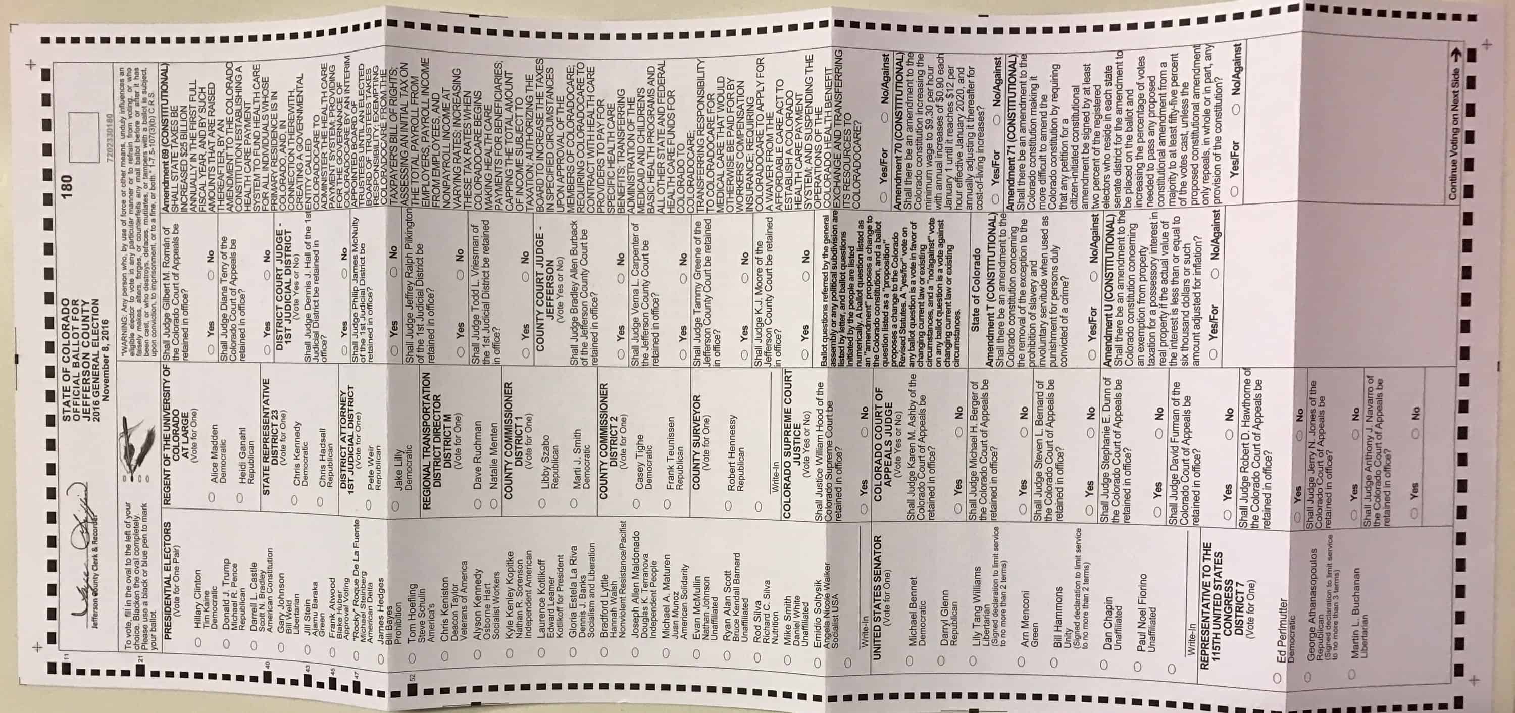
At any rate, after reviewing the online presence of all 23 candidates, from the U.S. Senate race to the local county surveyor, I came to the following conclusion:
Most politicians do not understand how to build their brand online.
Let’s face it, in politics, you need every advantage you can get which means politicians, more than anyone else, must get their online presence correct. It’s critical to building their brand and establishing their CareerKred in the eyes of voters. This is especially true for candidates running for local offices as they do not get the exposure of candidates seeking higher offices.
Like it or not, we live in a digital-first world where people turn to Google for answers before anywhere else. If candidates don’t appear in those search results, how else will potential voters find out where a particular candidate stands on the issues that matter to you? The best way for these candidates to get the word out about their campaign is by having a website.
Matthew Capala, friend and owner of Alphanumeric, a search engine optimization company, told me during our podcast interview “Invisibility is a fate worse than failure.”
In politics, if you are invisible, you will fail.
With this mind, what follows is a list of items I believe every politician, current or future, needs to keep in mind before they begin their political campaign in order to display their brands online in a way that will earn engagement, followers, votes and most importantly donations the next time they run for election.
DEFINE
The Define step of the DICE process is exactly what it sounds like. You must define your brand. Let potential voters know who you are and what you stand for. A candidate’s website must convey these two important tenants.
The first, letting your personality show online, helps voters understand who you are as a person, as a human being. Like a magnet, they will either be attracted to or repelled by you. Tapping into your personal brand on your website will not only make this happen but it can also win you votes and donations.
When I visit a website, any website, one of the first things I look for is something to tell me what the site and/or person is all about. I want to see this above the fold. Meaning, I should not need to scroll down the page to find out what you stand for.
In the time it takes the average teen to take a picture, apply a filter and upload it to Snapchat, I should be able to quickly ascertain what you’re all about. This is best achieved with a tagline or slogan, immediately followed with no more than 2 to 3 sentences explaining your position.
Your tagline should convey to voters at a high level, what you stand for. The “explainer sentences” underneath, should build on the tagline. Both should be brief, to the point and again prominently displayed above the fold.
If I have to search or decipher what you stand for, I’m out.
Seem harsh? Well, it’s a reality in today’s 8-second attention span age. As humans, we want and need a simplified and quick message. Capture my attention first and I might read more. You might even get me to donate.
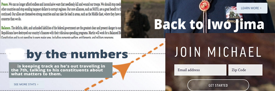
In the examples above none of them tell me anything about the candidate, at least nothing worthwhile that can be gleaned in 8 seconds. Out of all 23 websites I reviewed, only 5 defined what they stand for in a concise, to the point manner.
INTEGRATE
The Integrate step in DICE is the process of intentionally putting your personal brand online. This is where many of the candidates fell down. Especially, the 2 candidates who did not have a website. They were completely invisible.
If people can’t find you online, you will be skipped over. How else is a voter supposed to learn about you, your platform and stance on different issues? Your website is the one place during your campaign that you control 100% of the messaging. A pretty important thing in today’s world of social media and live streaming.
If you truly care enough about your community and your causes to run for an elected office, then please care enough to build and use a website. If you can’t be troubled to do that, well, it says a lot about your personal brand and frankly, your commitment to your campaign.
As you integrate your brand online, here are some DOs and DON’Ts to help your website help you as a candidate.
DO
Have a mobile responsive website
A mobile responsive website is one that displays well on any device, especially a smartphone. As voters, when we see your campaign signs or hear your name during a conversation for the first time, we may be compelled to look you up.
Generally speaking, we’ll do this with whatever device we happen to be in front of us at the time, which most likely will be our phones. Having a site that allows you to convey your message on any device is a huge bonus for you.
Unfortunately, 7 candidates did not have mobile responsive websites. This is No Bueno.
Have an issues page
This should be common sense, but as Michael Merrill told me, common sense is really not all that common. So, let me be very clear on this point. If you run for office in the future, please put an issues page on your site.
The issues page is where you can talk directly to potential voters about where you stand on the issues directly affecting them. If the thought of sharing your position on issues scares you, then you should not be running for office.
Additionally, the issue page allows you to integrate your story into your reasons behind the stance you are taking on various issues. This is an opportunity for your message to resonate with voters, boost your CareerKred and put your personal brand on display.
6 candidates did not have an issues page. A big missed opportunity.
Make your Donate button prominent
In my opinion, a campaign website serves three purposes.
- Provide the voter with the opportunity to get to know you and what you stand for.
- Provide the voter with the opportunity to get involved.
- Provide the voter with a way to donate to your campaign.
The last one should be sacred ground for all political candidates. Having run for an elected office myself, I can tell you donations will make or break your campaign. There is no such thing as a “free” run for office.
If you want to have a real shot at getting elected, you’ll need campaign contributions. So please, please, please make your Donate button very prominent on every one of your pages but especially on your home page.
Highlight the donate button, preferably in a color aligned with your brand. Make it bold. Put it front and center but whatever you do, do NOT bury it in the menu. Yes, technically, this is a Don’t but roll with me here.
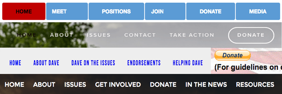
If you bury your donate button in the menu, there’s a good chance it will be missed. You are effectively hiding it in plain site. Make the donate button stand out and your contributions will go up.
Four candidates did not have a way to donate to their campaign. Four. Nine candidates made their donate button very prominent, but only two made the donate button the focus of their home page.
Add endorsements and testimonials to your home page
Endorsements and testimonials can be huge assets for politicians. Stop hiding them. Put them right on the Home page for everyone to see. Not all of them of course, but the ones you feel will really resonate with your voters. Hiding these testimonials on your “endorsements” page only serves to bury them in your site.
In today’s age of influence, endorsements and testimonials serve as social proof and can instantly boost your CareerKred. If you get endorsed by a big organization or prominent individual, you want that endorsement, those words, front, and center.
Think of an endorsement as a review on Amazon. Take them seriously and get them out front for all to see. Be proud of them or don’t list them at all. 8 candidates had endorsements hidden in the menu.
DON’Ts
Don’t put scrollers on your website
Scrollers, those rotating images or phrases that appear on too many websites, are so 2000’s. Scrollers are bad for a couple of reasons. First, they assume the viewer will take the time to read them. 8 seconds remember? Second, they violate what we discussed in the Define step.
Typically, scrollers move too fast and worse, they display too much or even unrelated information. One candidate had a scroller image showing the number of steps they had taken on the campaign trail. Really?
Scrollers typically offer nothing to help the reader, They were hot in the early 2000’s. For your political campaign, scrollers are a big Not. If you use them, you will appear as out of date as the scroller themselves.
5 candidates used scrollers.
Don’t use a hard-coded HTML website
Sure, it’s cool you know HyperText Markup Language (HTML). Unfortunately for you, that’s probably not a skill that will get you elected. It’s also not a skill you will likely use in office so ditch it. Always keep in mind, your site is a reflection of your personal brand and I promise you, you are not doing yourself any favors by using an HTML website.
What you are doing instead is sending the message that you, your brand and possibly your ideas are as outdated as your site.
I find it hard to believe sites like this still exist but they do and in my opinion, should never be used in a political campaign.
2 candidates had HTML websites. One was at least mobile responsive, the other, well let’s just say the candidate would have been better off not having a website at all.
Do not list everything in the site menu
Yes, I get it. You have a lot to offer the community but this doesn’t mean you need to list everything in your website menu. Doing so not only makes the top of your page look cluttered but as I stated earlier, It can actually have the effect of hiding the items that are important.
You see, our minds are drawn to simplicity. Sheena Iyengar, the author of the book The Art of Choosing, tells us that “too many choices overwhelm us and cause us to not choose at all.” This means rather than sift through the menu on your site to find what I’m looking for, I’d rather leave it and go look somewhere else.
Your website menu is truly a lesson in “less is more”. Think back to the three purposes of your website and only put the vital few on the menu such as the donate link and an issues page. Everything else you can talk about on your blog or your email newsletter.
CREATE
The create step in the DICE process requires you create relevant content for your audience. For politicians, your audience is potential voters. By default, as a politician, you will be viewed as a thought leader, someone whose ideas have the potential to shape local or national politics. As a voter, I want to know your thoughts and ideas.
Here are some ways for you to create relevant content to help educate potential voters about your brand and your stance on the issues.
Start a Blog
Because you are viewed as a thought leader, potential voters need to know your thoughts. One way to get your thoughts in public is through blogging. Blogging helps people get to know you. Blogging also provides your website with keywords and search terms voters will use in a search.
Friend and search engine optimization expert Todd Lohenry told me that showing up in search automatically provides you with a certain authority on a topic in the searcher's mind. Wouldn’t it be cool if a voter found your site because they were looking for information on a particular topic and you showed up in the search results?
Only 5 candidates had a blog on their site.
Use Video
Video. Video. Video. Depending on which article you read, video will drive up to 84% of all internet traffic by 2018. Yes, I know it’s 2016, but do you really think all those videos will show up online in the year 2018?
Today, 300 hours of video is uploaded to YouTube every minute. Every. Minute. Videos will not only garner attention on your site but they are a great way to show off your brand and connect with people on a personal level. A video allows you to share your story visually, instead of hiding it in the words on your About page.
As I reviewed all of the campaign sites, I was struck by one candidate in particular who was a veteran but didn’t share that until several paragraphs into their About page. A video right on the front page would have done this candidate much better justice.
In case you think you need to hire a camera crew, to create your campaign videos, think again. You can make great videos using the camera on your phone. Speaking of your phone, the next time you speak at an event or you feel the need to share your thoughts on one of the issues, jump on Periscope or Facebook Live. Let people see you in action and hear from you personally. Video will help people start to like you which can drive votes.
7 candidates had a posted a video on their website.
Deliver your thoughts on the issues in downloadable files
Not one website I reviewed offered a document I could download and read at my leisure.
The document could be used to spell out your stance vs your opponent's on a variety of issues. It could also be a list of other candidates who support your positions and need to be elected too. Think of it as a cross-promotional document, “If you agree with me, I know you’ll like these folks, too.”
In online marketing parlance, a downloadable file acts as a lead magnet for your site visitors. The lead magnet turns visitors into subscribers and once you have people on your email list you have the opportunity to engage with them by sharing additional relevant information so they can make an informed decision on election day.
ENGAGE
The Engage step of DICE is all about engaging with your audience (voters) in order to build trust. If you believe people do business with those they know, like and trust, why would politicians be any different?
Collect email addresses
I won’t belabor this point too much but here’s the secret to success with using email as a method to engage your audience.
You actually have to send emails.
By providing their email address, the voter is inviting a deeper conversation with you. They want to hear more from you and they are giving you permission to start the conversation in their inbox. This is a big deal.
Fifteen of the 23 candidates offered a method to capture email addresses. I signed up for them all. Unfortunately, only eight of them sent an email. To their credit, I believe those eight candidates are trying to make up for everyone else based on the amount of email I receive from them.
For the other seven candidates, I think my email address went into a black hole. I heard nothing back. Not even a Thank you.
Have a Thank You page
As simple as it sounds, a thank you page is where you redirect a voter to say thank you to them for giving you access to their inbox or for their donation. Our email inbox is one of the last sacred places online and receiving someone's email address is not something to be taken lightly.
The Thank You page is a great place for the candidate to personalize the relationship with the voter and to further share their brand. This is also a great place to start the conversation by helping the voter understand how they can get involved with your campaign.
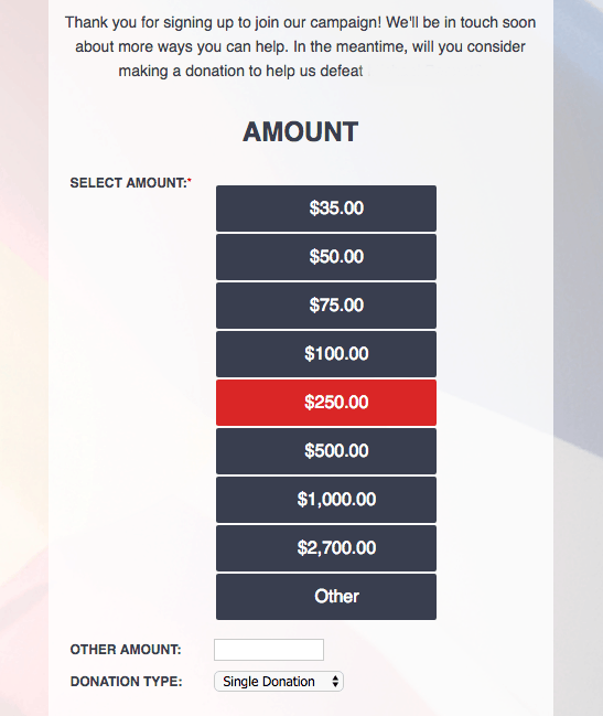
Thank you pages should let voters know what to expect from you and most importantly, it should invite the voter to donate to your campaign.
Only two candidates collecting emails did this well. This example was the best. Notice the highlighted amount. That’s not by accident.
Get Social
There is no way around it. We live in a social age and social media is THE way people like to engage. So, here’s the deal. If you are going to put social media icons on your website, please be social.
I think candidates get the importance of social media at a high level. Sadly, they are train wrecks at execution. 18 candidates had social media icons on their website. Only 6 of the 18 had been active on social media in the last 24 – 48 hours.
Two candidates had virtually zero social presence and of the two, one had never used their platform at all. Not once.
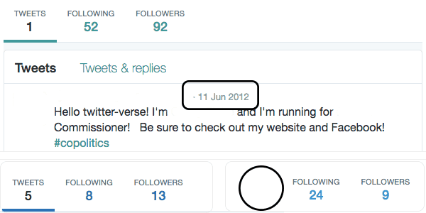
I’m a huge Twitter fan for reasons I discussed on this podcast, so I decided to check the profile of any candidate who displayed a Twitter icon. There was 14 total. 4 candidates didn’t even bother to complete the bio for their account and one hadn’t tweeted since 2012 when their account was created.
So here’s the thing. Don’t put a social media icon on your website if you’re not going to use it!
Social media is such a great way for you to speak directly to and engage with voters. Instead of paying it lip service, embrace it.
CONCLUSION
In today’s digital-first world, making your brand stand out from your competition is paramount. For politicians, standing out can be the difference between winning or not.
A key component of standing out is having a website. You can call it a campaign website if you like, but at the heart of the website is you and your brand.
Your website provides you the platform you need to tell your story in a cohesive and engaging way. It helps people get to know, like and trust you. Additionally, it provides you the opportunity to engage with voters directly and most importantly it allows you to keep your campaign moving forward through donations.
Use your website correctly and your brand will rock.
Use it incorrectly, and well, there’s always the next campaign.
