Of course, the reason different things resonate is that we are all at various stages of our personal and professional growth. What resonates with you, is merely an indicator of where you are in your process. Some people will be ahead of you and others behind.
This past weekend, I had the pleasure of speaking with a group of about fifty, passionate career development professionals at the National Career Development Association annual conference.
My topic, how you can build a digital brand that boosts your career, is based on my book CareerKred which one the attendees dubbed, “Digital Marketing for Your Personal Brand.” Thank you, Karol.
It does make me wonder, however, if that shouldn't be the name of my book. Hmm…
During the presentation, I walked attendees through the four steps of the DICE process and because of the audience, I decided to add a couple of slides I felt would be highly relevant for the group.
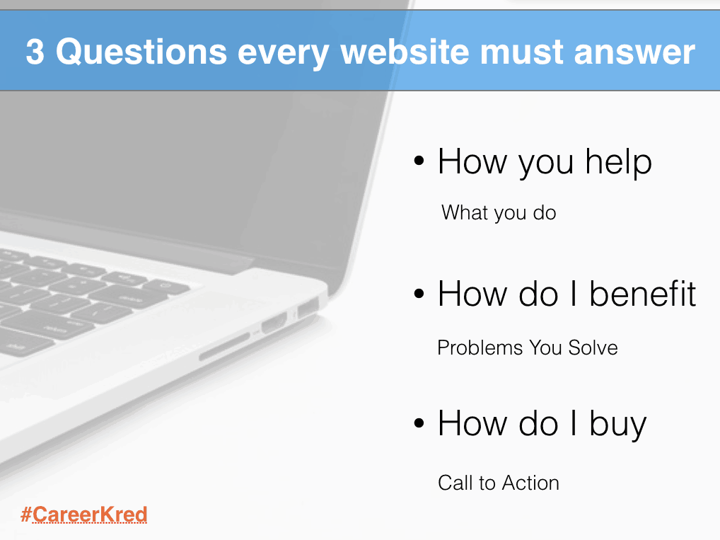
One of the new slides I added is below. It resonated with several of the attendees.

During my research on the topic of digital marketing/branding, I've run across many “trends” and “styling” guides for websites. While they all make sense in their own right, the best piece of advice I've received about websites came during my StoryBrand certification training.
The three questions every website should answer.
Question One – How You help?
Another way to state this question is, what do you do. I guarantee many of you are reading this right now and thinking to yourself, “I do this,” check, let's move on.
Not so fast there my friend.
This question isn't as easy to answer as you may think, especially when filtered through the eyes of your customer. You see what's second nature to you, is new to someone else (see my post on the curse of knowledge).
In this age of short attention spans, you need to be able to answer how you help in straightforward, clear language.
You may very well “see no limits” for your client's business because “success has no limits when you have the right partner,” but what you do is digital marketing. The other stuff is fluff.
Know what you do and say it. When it comes to your message, clear beats creativity every day.
Don't make your customers burn calories trying to figure out what you do or they'll leave and possibly never come back.
Question Two – How do I (your customer) benefit?
Websites should be customer facing, meaning they should be written for your customer, not yourself; however, this is easier said than done.
Many business and personal brands I work with tend to point their website directly at themselves and their products. “Look what I can do,” “Look at all my great products.”
I get this. You worked hard to develop your products, your brand, etc., but here's a simple truth to keep in mind about visitors to your website.
They don't care about you (or your products), they care about themselves.
People come to your website for one reason; they are seeking a solution to a problem they are experiencing. If you want them to care about you and what you offer, then talk about their issues and position your products as the solution.
Using this approach will help your visitors understand how they benefit from choosing you over the competition.
Question Three – How do I (your customer) buy?
Seth Godin said,
“In a world where we have too many choices and too little time, the obvious thing to do is just ignore stuff.”
People “ignore stuff” on websites for many reasons but here are two specific reasons they may be bouncing from your site.
First, your website is “full of stuff” such as buttons and links to click. I've reviewed sites that have twenty actions you could take on the home page alone. Twenty. Too many choices.
Second, the website has all the essential “stuff” buried in the menus, often three and four clicks deep. I know you've visited those sites. Finding information hidden deep in a menu is like going to page two in a Google search. Who does that?
So, here's a little secret to getting more “clicks” on your website, determine what you want visitors to do when they arrive on your site.
It helps to ask yourself, what is the ONE thing I want them to do? Schedule a call? Buy a product? Donate to the cause?
Whatever you decide the Call to Action for your website should be, make it very clear for your visitors. Don't make them think about it. Instead, make it clear and repeat it all the way down the page.
For visitors not yet convinced, offer them a second choice in the form of something valuable like a guide, they can take with them in exchange for an email address then they can continue the journey with you even after they leave your site.
So, whether you are a personal brand or a business brand, if you want to capture more leads, bring in new opportunities and increase your sales, make sure you answer these three questions on your website.
Your customers will thank you for it.


